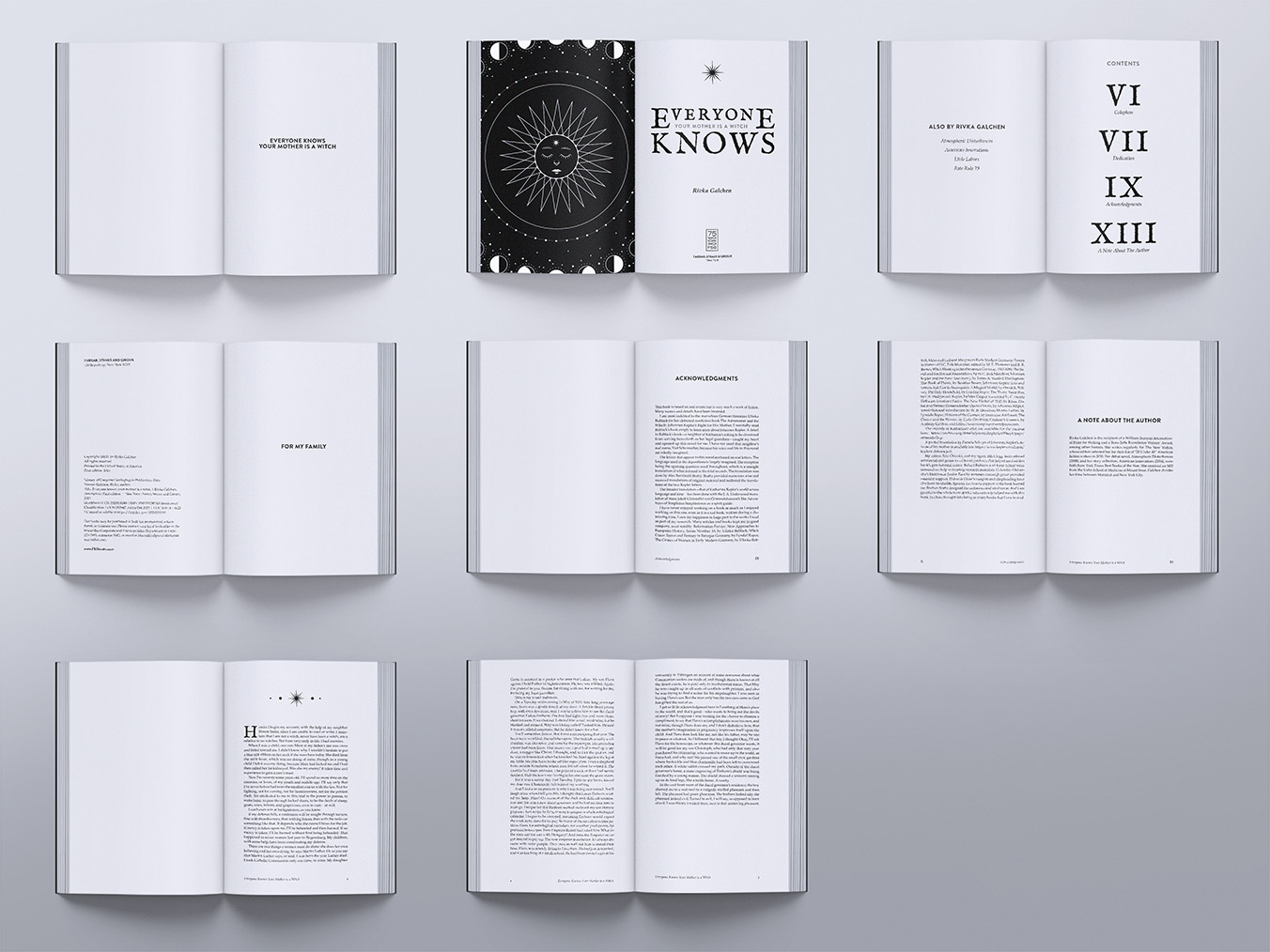
This school project was unique, as it forced my colleagues and me to interact with the client and bring her vision to life. After reading the novel and asking the author how she interpreted the book, I felt overwhelming sadness and isolation through my connection with the main character: Katharina. This sombre mood is reflected in the lower portion of my illustration as well as the organic nature of the display face; this mood is then contrasted by the mathematical perfection of the astrological symbols and clean sans-serif type, reflecting the disparity between Katharina's situation and that of her oppressors.
My typographic choices required a lot of thought during this project, as it was challenging to create a grunge-like aesthetic that still felt modern and professional. Despite my doubts about the direction of my designs, my classmates were there to offer many amazing suggestions and encouraged me to keep progressing my concept. This process reminded me of the importance of collaborative design and utilizing the other minds in the room to learn and develop my work.
I was very pleased with my illustrative elements in the end, as I felt I was able to communicate my vision through each of the different stylistic elements. Overall, this project was a great success, and the author was quite pleased with how I was able to emulate the emotions within the novel.